
Introduction to GAP Logo Redesign Marketing Case Study:
In 2010, Gap, the iconic clothing retailer, attempted a dramatic overhaul of its well-established logo. The Gapgate became a legendary marketing case study, demonstrating the pitfalls of premature rebranding and the importance of understanding your audience. Let's analyze the GAP logo redesign failure, extracting necessary lessons for businesses seeking to revive their brand identity.
GAP: The Brand Everyone Knew
The GAP Backlash Consumers Revolt:
The new GAP logo triggered an immediate and overwhelmingly negative reaction from consumers and branding experts. Social media erupted with criticism:
Twitter: A protest account [@GapLogo] quickly amassed thousands of followers.
Facebook: GAP's Facebook page is flooded with unfavourable comments.
Parody: A "Make Your GAP Logo" website went viral, showcasing thousands of satirical redesigns.
The "GAP" Unnecessary Redesign Logo


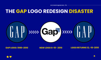
Gap started in 1969 and became famous for its classic American fashion and the logo was minimalistic but easy to remember – white letters inside a dark blue box. The logo was a part of their brand for 20 years, and everyone recognized it. The GAP marketing case study shows it is important to understand how customers feel about your brand.
In October 2010, GAP suddenly revealed an entirely new logo. Remember that familiar blue box? It was still in the logo but much smaller and shoved into a corner. The word "GAP" was now written in a plain, black font. This new logo was designed by a well-known branding company called Laird and Partners and cost a shocking $100 million. This decision by GAP is a learning for every marketing student and expert and how customers feel about your brand before changing it instead of making their brand logo that reflects the brand they designed.
GAP's leaders said they wanted a "modern, sexy, and cool" look, trying to boost the brand's image after sales went down and no other changes to the company or its products with this new look this whole mess shows how rebranding can go wrong, making it a valuable marketing case study about staying connected with customers.
The outcry centred on several key criticisms:
Unrecognizable: The new logo severed the brand's visual identity, confusing loyal customers.
Emotional Disconnect: The bland, generic design lacked the familiarity and warmth consumers associated with Gap.
Unjustified Change: There seemed to be no compelling reason for the abrupt redesign, further alienating consumers.


GAP's Humbled Retreat
Within a mere week of the rebrand launch, GAP capitulated. The original logo was reinstated, marking a humiliating and costly failure. The company acknowledged the misstep, conceding that they had underestimated the deep connection their customers felt towards the brand's visual identity.


What Marketers Can Learn from GAP's Blunder, Key Lessons:
The GAP logo debacle offers valuable insights for any brand considering a rebrand, crucial takeaways are as follows:
Don't Underestimate Brand Loyalty: Never assume customers will easily accept drastic changes to a beloved Brand.
Meaningful Change: Significant visual rebrands must align with a larger strategic shift. A new logo won't solve fundamental business problems.
Know Your Audience: Involve consumers in your rebranding process, test concepts, and gauge reactions before official launches. GAP redesign seemed out of touch with its core audience.
The Power of Social Media: Today, brand missteps spread virally. Monitor online sentiment and be prepared to respond when criticism occurs.
Author's Conclusion:
The GAP logo fiasco stands as an exemplary tale for marketing case studies. It reinforces the importance of carefully considered rebranding initiatives prioritising customer connection, strategic alignment, and a deep understanding of what gives your brand its enduring value in consumers' eyes.